Glassdoor Reviews Analysis
According to their website, Glassdoor “is one of the world’s largest job and recruiting sites”. It provides anonymous reviews from current and previous employees of companies that are outside the reach of the employers’ moderation, which means people are able to speak their mind about their experiences. There are several categories of ratings, including an overall star rating and how positive their outlook for the company’s future is, among others, as well as space for a written description. Companies are able to respond to reviews, but not modify or remove them. It’s also possible to upload your CV to help with job hunting.
Project Aim
This project aims to analyse a sub-section of the reviews of a global UK-based technology company, which will remain unnamed. The analysis consists of a visual timeline containing raw and processed review data with markers for key events, both in the context of the country and the company. In addition, some tabulated statistical analyses is performed and stored in markdown in an auto-generated readme file. This readme includes the plots and, due to its name, is automatically displayed on the GitHub repo.
Links
- GitHub - results and source code
- Glassdoor - company reviews (requires a Glassdoor account)
Contents
Setup
Dependencies & Imports
To perform all the necessary processing, some third party libraries need to be installed, namely: numpy, pandas, matplotlib, and scipy. To install these dependencies, run:
pip install -U numpy pandas matplotlib scipy
If using the requirements.txt file in the repo, these among others will be installed, including the interactive Python kernel, ipykernel:
pip install -r requirements.txt
Then, at the top of the script, the following imports are required:
from collections import Counter
from datetime import datetime, timedelta

import matplotlib.pyplot as plt
import numpy as np
import pandas as pd
from scipy.signal import butter, filtfilt
Constants & helpers
To store the Dates Of Interest (DOI) to mark on the timeline, we can make use of the zip() function in conjunction with tuple unpacking to neatly store the labels, dates, and colours of each:
DOI_LABELS, DOI_DATES, DOI_COLOURS = zip(
    ("2011", datetime(2011, 1, 1), "black"),
    ("CEO 1", datetime(2011, 9, 1), "black"),
    ...
    ("2021", datetime(2021, 1, 1), "black")
)
In addition, we can create two helper functions to return the date of a DOI given its label and vice versa:
def doi_date(label: str) -> datetime:
    try:
        return DOI_DATES[DOI_LABELS.index(label)]
    except (ValueError, IndexError):
        return None


def doi_label(date: datetime) -> str:
    try:
        return DOI_LABELS[DOI_DATES.index(date)]
    except (ValueError, IndexError):
        return None
The first of these helper functions can then be used to set intuitive start and end dates for the timeline, removing the need to manually add a year, month, and day:
START_DATE = doi_date("CEO 2")
END_DATE = datetime(2020, 12, 6)

N_DAYS = (END_DATE - START_DATE).days + 1
Other constants, including the title of the generated readme file and the lengths of the data low-pass filters, are also defined:
README_TITLE = "Glassdoor Data (UK, Full Time)"

PLOT_TIMELINE_NAME = "plot_timeline.png"

# variables and order to plot in the timeline
TIMELINE_KEYS = "stars recommends outlook ceo_opinion".split()

FILT_SHORT_HOURS = 24 * 365 / 52 * 2  # 2 weeks
FILT_LONG_HOURS = 24 * 365 / 12 * 2  # 2 months
FILT_ORDER = 2

Y_SCALE = 0.8
Data
Acquire
Glassdoor actively block web-scraping using programmatic approaches, such as the requests and beautifulsoup4 packages. They do however provide a developer API to interact directly with their data. In this project, a more manual approach of loading each page of filtered reviews and entering the information into an Excel spreadsheet is taken. There are only a few hundred reviews of interest and this also requires no extra knowledge or installation of an API.
The columns and data format of the spreadsheet are the following:
| date | stars | is employed | is technical | recommends | outlook | ceo opinion | years employed |
|---|---|---|---|---|---|---|---|
stryyyy-mm-dd | int1 to 5 | bool0 or 1 | bool0 or 1 | bool0 or 1 | int-1 to 1 | int-1 to 1 | int≥ 0 |
Any missing sections in the reviews are left blank in the raw data. The reviews are filtered to only include those based in the UK and who work/worked full time. In total, 379 reviews are captured across a span of nearly 10 years.
Load
pandas makes it easy to work with Excel files with its read_excel() function. Passing the name of the Excel file is all that’s needed to parse it into a pandas.DataFrame object with any missing values being stored as nan (not a number). In addition, the method provides a variety of keyword arguments, including for specifying the names of the stored columns, which columns to parse as dates, and which date parser function to use. Two assert statements are used to ensure the order is correct and there are no missing values in the stars column, which is a required field in the reviews. Once these have passed, the data is sorted into ascending date order and out of range rows are removed:
raw = pd.read_excel(
    io="data.xlsx",
    names=(
        "date",
        "stars",
        "employed",
        "technical",
        "recommends",
        "outlook",
        "ceo_opinion",
        "years"
    ),
    parse_dates=["date"],
    date_parser=datetime.fromisoformat
)

# Excel file should be in descending date order
assert all(a >= b for a, b in zip(raw["date"][:-1], raw["date"][1:]))

# ensure all star ratings are present
assert not any(raw["stars"].isna())

# order dates in ascending order
raw.sort_values("date", inplace=True)

# discard values outside date range of interest
raw = raw[(START_DATE <= raw["date"]) & (raw["date"] <= END_DATE)]
There are a few useful methods in the code above worth mentioning alongside pandas.read_excel(). The isna() method can be called on a DataFrame or Series object and returns a boolean array indicating which elements are nan. The datetime.fromisoformat() class method, introduced in Python 3.8, is used as the date parser and converts dates from the ISO format (yyyy-mm-dd) into datetime objects.
Statistics
At this point, we can run some basic statistics on the raw data to extract insights. A Markdown report can be easily generated with a table showing the results and an image of the timeline plot (created later).
An interesting insight we can gain from the raw data is the opinion of different CEOs according to the reviews. The start and end dates for each CEO can be retrieved using the doi_date() function defined earlier. These can be used to select only the reviews that were made during their employment:
ceo_2 = (doi_date("CEO 2") <= raw["date"]) & (raw["date"] < doi_date("CEO 3"))
ceo_3 = (doi_date("CEO 3") <= raw["date"])

ceo_2_opinion = raw["ceo_opinion"][ceo_2]
ceo_3_opinion = raw["ceo_opinion"][ceo_3]
Using the & operator, the element-wise and operator for two DataFrame objects, allows the conditions to be combined to select only the reviews we want. In the case of CEO 3, they are still employed so there is no end date for them.
Other information we can extract includes the proportion of reviewers that gave a 1 or 5 star rating and how often people recommend the company. We create Boolean arrays describing which reviews meet these conditions along with labels to describe what is being looked at and a Boolean value indicating whether a large proportion of True values is good or bad:
stats = (
    (raw["stars"] == 5, "5 Stars", True),
    (raw["stars"] == 1, "1 Star", False),
    (raw["recommends"], "Recommend", True),
    (raw["outlook"] == 1, "Positive Outlook", True),
    (raw["outlook"] == -1, "Negative Outlook", False),
    (ceo_2_opinion == 1, "Approve CEO 2", True),
    (ceo_2_opinion == -1, "Disapprove CEO 2", False),
    (ceo_3_opinion == 1, "Approve CEO 3", True),
    (ceo_3_opinion == -1, "Disapprove CEO 3", False),
)
Report
Building the report is broken down into a few stages:
- Format some report elements and store in variables
- Define function for generating stats table row
- Define function for generating whole stats table
- Create report file (
README.md) - Write formatted header, table, and plot image to file
The formatted elements are the start and end dates. These are defined in the constants above and can be converted to a string representation using the datetime.strftime() method. However, I personally don’t find this the most readable way to do it. An alternative is to use Python’s built-in format() function, passing the date and format string as arguments. To make it more user friendly, if the date exists in the DOI list, we concatenate the corresponding label in brackets. In addition, variables defining the reference names to use for coloured indicators are set:
# references for colour indicators
good, ok, bad = "good ok bad".split()

# nicely formatted dates for report
start = format(START_DATE, "%Y-%m-%d")
start += f" ({label})" if (label := doi_label(START_DATE)) else ""

end = format(END_DATE, "%Y-%m-%d")
end += f" ({label})" if (label := doi_label(END_DATE)) else ""
This code uses assignment expressions with the “walrus” operator (:=) to allow the doi_label() function to only be executed once. The result gets stored in label before the condition is evaluated meaning if it’s truthy, i.e. a valid label was returned, it can be used directly in the format string. Assignment expressions were introduced in Python 3.8.
The row creator function make_row() takes several arguments: a Boolean array describing which rows satisfy a particular condition (bools), a string describing the condition (label), and a Boolean value indicating whether a high statistic value is good or bad (positive). A great feature of Python is that functions can be nested inside other functions, which means they have access to the arguments passed into their parent. The indicator() function is defined inside the row creator function and uses the value of positive to determine which colour should be chosen when creating an indicator. The fraction of bools that is True is calculated for the whole array and then subsections based on whether the reviewer is in a technical role and if they are employed. These fractions are passed to the indicator() function and the results are formatted into a string which becomes the contents for each cell. All the cells are joined by a pipe symbol (|) to create a valid Markdown table row:
def make_row(bools: np.ndarray, label: str, is_positive=True) -> str:
    def indicator(frac: float) -> str:
        if is_positive:
            colour = good if frac >= 2 / 3 else ok if frac >= 1 / 3 else bad
        else:
            colour = bad if frac >= 2 / 3 else ok if frac >= 1 / 3 else good

        # create Markdown image with link to colour indicator
        return f"![{colour}]"

    # calculate all statistics for row
    fracs = (
        bools.mean(),
        bools.where(raw["technical"] == 1).mean(),
        bools.where(raw["technical"] == 0).mean(),
        bools.where(raw["employed"] == 1).mean(),
        bools.where(raw["employed"] == 0).mean(),
    )

    # format results
    results = (f"{indicator(frac)} {100 * frac:.0f}%" for frac in fracs)

    # create row data separated by pipes
    return "|".join([label, str(len(bools)), *results])
The table creator function make_table() takes no arguments and returns the whole table as a string. First, it creates the references needed to insert the coloured indicators mentioned previously. These use an online placeholder image service to create small coloured squares as a workaround to Markdown’s lack of ability to define text colour. Then the header row is defined before all the rows created using make_row():
def make_table() -> str:
    # create 10x10 colour indicators
    indicator_refs = (
        f"[{good}]: https://via.placeholder.com/10/0f0?text=+\n\n"
        f"[{ok}]: https://via.placeholder.com/10/ff0?text=+\n\n"
        f"[{bad}]: https://via.placeholder.com/10/f00?text=+\n"
    )

    # create table header
    header = (
        "Statistic|N|Overall|Technical|Non-technical|Employed|Ex-employee\n"
        "-|-|-|-|-|-|-"
    )

    # create generator for all rows
    rows = (make_row(bools, label, is_pos) for bools, label, is_pos in stats)

    # join everything with line feeds
    return "\n".join([indicator_refs, header, *rows])
With all the functions defined, the final step is to create the file and write the content. This is done using a with statement and the built-in open() function. Another small helper write_section() is defined inside that adds a double line feed after each write:
with open("README.md", "w") as readme_f:
def write_section(section: str):
readme_f.write(section + "\n\n")
write_section(f"# {README_TITLE}")
write_section(f"## {start} to {end}")
write_section(make_table())
write_section(f"")
Processing
Clean
To clean up the raw data, we can first drop any rows and columns that are not of interest. These are the reviews before START_DATE or after END_DATE and the review data that we’re not going to plot. This can be done with the following indexing on the raw data:
in_date_range = (START_DATE <= raw["date"]) & (raw["date"] <= END_DATE)
clean_cols = ["date", *TIMELINE_KEYS]

clean = raw[in_date_range][clean_cols]
At this point, the data is not in a good format to work with as many of the timestamps are duplicated. To solve this, we can select all occurrences of the duplicate dates by using the Series.duplicated() method with the keep keyword argument set to False:
dup_date_data = clean[clean["date"].duplicated(keep=False)]
Then, we can use DataFrame.groupby() to iterate through each unique duplicated date and all the rows with this date. By taking the index of these rows, we can modify the clean data at these locations to assign unique timestamps. The pandas.date_range() function provides a way to generate a sequence of equally spaced timestamps by providing the start and setting the periods and freq keywords. The number of periods is equal to the number of rows in the group and we can choose 1 hour as the frequency to handle up to 24 reviews on the same day. If we had more than this on any given day, a more granular time interval would need to be chosen, e.g. 1 minute would allow up to 1,440 reviews per day. The following code performs these operations:
for date, group in dup_date_data.groupby("date"):
    hourly_range = pd.date_range(date, periods=len(group), freq="H")

    clean["date"][group.index] = hourly_range

# ensure all dates are unique
assert not any(clean["date"].duplicated())
Now all rows have a unique timestamp, the nan values, which are the data points that are missing in the original review data, can be handled. nan values are a problem because any operation performed on them always results in another nan. For instance, attempting to filter an array containing even a single nan value results in the whole output becoming nan.
This project takes a 2-step approach to the missing values: inference based on another column then filling any remaining nan values with a reasonable constant. The column used to infer is the stars column as it is guaranteed to have a value and reflects the overall sentiment of the review. For example, if a reviewer does not explicitly mention whether they recommend the company or not, it is likely that if they rate the company 4 or 5 stars out of 5, they would also recommend. Similar logic can be applied to the outlook of the reviewers:
missing = clean["recommends"].isna()
clean["recommends"][missing & (clean["stars"] >= 4)] = 1

missing = clean["outlook"].isna()
clean["outlook"][missing & (clean["stars"] >= 4)] = 1
clean["outlook"][missing & (clean["stars"] <= 2)] = -1
Combining the result of the isna() method with & allows only nan values to be selected and modified. The Boolean array on the right hand side of the operator represents which elements in the stars column allow us to infer data.
This still leaves some nan values, so as a final step, these are simply filled with values equal to the average of the upper and lower limits of the column:
clean["recommends"].fillna(value=0.5, inplace=True)
clean["outlook"].fillna(value=0, inplace=True)
clean["ceo_opinion"].fillna(value=0, inplace=True)
Interpolate
In order to properly filter the data, we need the reviews to have no duplicate timestamps and be spaced evenly. The former requirement has been met from our work in the previous section, now we just need to resample the data with a regular time interval of 1 hour (the same as the frequency we set earlier). One way to do this is with the numpy.interp() function. This takes the original timestamps and data along with the new timestamps we’d like to sample at, which is the regular hourly interval. We can convert the existing timestamps into a pandas.DatetimeIndex by passing them to its constructor (this makes them the same type as the output of pandas.date_range()) and the pandas.date_range() function again to generate the new timestamps.
start = clean["date"].min()
end = clean["date"].max()

clean_date = pd.DatetimeIndex(clean["date"])
interp_date = pd.date_range(start=start, end=end, freq="H")
np.interp() requires the indexes to be numeric, not date objects. We can convert them into the number of hours from a reference point to get a numeric representation by subtracting the start date from each and calculating the total number of seconds each of these time deltas represents divided by the number of seconds in an hour (3600). These indexes stay constant across all the interpolations so we can define a helper function to perform it with these values fixed:
# calculate numerical index to interpolate on
clean_delta_days = (clean_date - start).days
interp_delta_days = (interp_date - start).days

# function for performing interpolation
def do_interp(col: pd.Series) -> pd.Series:
    return pd.Series(np.interp(interp_delta_days, clean_delta_days, col))
Having the helper is convenient (and both col and the return value are pandas.Series) because we can pass it into the DataFrame.apply() method to process each column of the data in turn to return a new processed DataFrame. Before this we need to drop the date column; we don’t want to interpolate this as this is the index we’re using to actually perform the interpolation. Finally, we can set the new interpolated timestamps as the index of the DataFrame:
# remove date column, apply interpolation, set interpolated date index
interp = (
    clean
    .drop(columns="date")
    .apply(do_interp)
    .set_index(interp_date)
)
This multi-lined layout is my personal preference for this piece of code as I think it more clearly shows the different steps in the chain while still only setting interp once.
Filter
Now we have a dataset with a unique, regular timestamp, we can perform filtering. The type of filter used in this project is a 2nd order Butterworth low-pass filter. The scipy.signal module provides a function called butter() to generate the filter coefficients provided the order and normalised break frequency. Knowing our sample rate is 1 hour allows us to calculate the break frequency easily as it is simply the reciprocal of the length of the filter in hours. For example, if we wanted to filter trends that were happening faster than 1 week, the normalised break frequency would be equal to:
\[ \frac{1}{1 \space \textrm{week} \times 7 \space \frac{\textrm{day}}{\textrm{week}} \times 24 \space \frac{\textrm{hour}}{\textrm{day}}} \approx 0.00595 \space \textrm{hour}^{-1} \]
We create 2 sets of filter coefficients with different break frequencies to allow us to see if there are any trends on multiple time scales. Similar to the interpolation step, we create helper functions that will be used with DataFrame.apply():
# filter coefficients
b_short, a_short = butter(FILT_ORDER, 1 / FILT_SHORT_HOURS)
b_long, a_long = butter(FILT_ORDER, 1 / FILT_LONG_HOURS)


# functions for performing filtering
def filt_short(col: pd.Series) -> pd.Series:
    return pd.Series(filtfilt(b_short, a_short, col))


def filt_long(col: pd.Series) -> pd.Series:
    return pd.Series(filtfilt(b_long, a_long, col))
Unlike the interpolation step, we want to process all the columns as the date is now stored as the index of each row rather than its own column. Therefore, we don’t drop() any columns before calling apply(). Finally, the index is set equal to that of the original data:
lp_short = interp.apply(filt_short).set_index(interp.index)
lp_long = interp.apply(filt_long).set_index(interp.index)
Visualisation
A common way to create a figure with a grid of axes is to use the matplotlib.pyplot.subplots() function. Here, we create 5 rows of axes with a single column and a shared x axis. Using tuple unpacking, it’s convenient to break apart the axes array so we can individually reference each axis by name. The Figure.subplots_adjust() method allows us to set various spacing parameters to customise the layout of the figure and the Figure.suptitle() method can be used to set an overall title at the top of the figure. The size of the whole figure window can be set using Figure.set_size_inches() and main background colour is set with Figure.set_facecolor(), which defaults to transparent:
fig, axes = plt.subplots(5, 1, sharex=True)
stars_ax, recommends_ax, outlook_ax, ceo_opinion_ax, freq_ax = axes

fig.subplots_adjust(left=0.08, bottom=0.11, right=0.92, top=0.9, hspace=0)
fig.suptitle(
    f"{README_TITLE} Timeline\n"
    f"total reviews: {len(clean['date'])}, "
    f"date range [years]: {N_DAYS / 365:.1f}, "
    f"long filter [months]: {FILT_LONG_HOURS / 24 / 365 * 12:.1f}, "
    f"short filter [weeks]: {FILT_SHORT_HOURS / 24 / 7:.1f}"
)
fig.set_size_inches(20, 12)
fig.set_facecolor("white")
Timeline
The main part of the plot is the raw time series review data along with the filtered trends. We want to be able to mark all of our DOIs so we can see how they align with various features of the data. To do this, we need to define where the ticks on the x axes will be using the DOI, start, and end dates. The label for each of these dates will be in the DOI labels, though if the start or end date is not in the DOIs, we can just use the ISO format to display it. We set the limits of the x axis to be from a day before the start to a day after the end to allow some buffer:
filt_dates = (d for d in DOI_DATES if START_DATE < d < END_DATE)
xticks = (START_DATE, *filt_dates, END_DATE)
xticklabels = tuple(doi_label(d) or format(d, "%Y-%m-%d") for d in xticks)
xlim = [START_DATE - timedelta(days=1), END_DATE + timedelta(days=1)]
Since all axes share the same x axis, these become constants for all axes. However, there is also plenty of axis dependent data. We can use zip() to bundle this into an iterable that can be looped over. Since all the formatting code is the same for each plot, all we need to do is provide the specific values for each, such as the labels for the y ticks:
plot_data = zip(
    axes,
    TIMELINE_KEYS,
    "Stars|Recommends|Outlook|CEO Opinion".split("|"),  # y labels
    ((1, 5), (0, 1), (-1, 1), (-1, 1)),  # y limits
    (  # y tick labels
        "1 2 3 4 5".split(),
        "No Yes".split(),
        "Negative Neutral Positive".split(),
        "Disapprove Neutral Approve".split(),
    )
)
The plot loop can be broken broadly into 2 parts: plot the data series and format the axes. Using tuple unpacking, the data bundled into the plot_data variable is dealt out to the 5 variables in the for loop statement. The values to plot are extracted from the respective DataFrame objects using the key variable and scale according to the Y_SCALE constant, using the scale() helper function. Each series is then plotted using the the appropriate plotting method, Axes.scatter() for the raw data and Axes.plot() for the low pass filtered data. The short length low pass filtered data is plotted in red and then just the positive parts are plotted on top in green to make it easier to interpret:
# loop to populate and style all data plots
for ax, key, title, ylim, ylabels in plot_data:
    y_mid = np.mean(ylim)

    def scale(data):
        return Y_SCALE * (data[key] - y_mid) + y_mid

    raw_ = scale(raw[key])
    lp_short_ = scale(lp_short[key])
    lp_short_positive = np.where(lp_short_ > y_mid, lp_short_, np.nan)
    lp_long_ = scale(lp_long[key])
    yticks = scale(np.arange(ylim[0], ylim[1] + 1))

    # plot all series
    ax.scatter(  # raw employed
        raw["date"], raw_.where(raw["employed"] == 1),
        marker="x", linewidth=0.5, label="Employed (raw)"
    )
    ax.scatter(  # raw ex-employee
        raw["date"], raw_.where(raw["employed"] == 0),
        marker="x", linewidth=0.5, label="Ex-employee (raw)"
    )
    ax.plot(  # filtered data
        lp_long.index, lp_long_, "grey",
        lp_short.index, lp_short_, "red",
        lp_short.index, lp_short_positive, "green",
        linewidth=1
    )

    # ...
The second half of the loop is dedicated to formatting the axes. We can use Axes.set() with keyword arguments to set multiple parameters in a single statement. Those parameters that it isn’t possible to set this way, for instance if we need to pass additional formatting arguments, can be set using the corresponding Axes.set_{parameter}() method. To add a secondary y axis on the right hand side of each plot, we can use Axes.twinx(). Both this and the original y axis require the same formatting, which can be concisely performed using the matplotlib.pyplot.setp() function. This takes an iterable of Axes objects and applies the same formatting to each. Finally, we draw vertical lines to mark each of the DOIs. After the loop, we add a legend to the first plot (all the legends are the same) and position its bottom left corner to be just above the plot’s top left corner:
    # ...

    # set axis properties
    ax.set(
        xticks=xticks,
        xlim=xlim,
    )

    # can't be set with ax.set()
    ax.set_xticklabels(xticklabels, rotation=90)
    ax.grid()

    # create y axis on right hand side and add ticks and labels
    plt.setp(
        (ax, ax.twinx()),
        yticks=yticks,
        yticklabels=ylabels,
        ylabel=title,
        frame_on=False,
        ylim=ylim,
    )

    # add vertical lines at the dates of interest
    for date_, colour in zip(DOI_DATES, DOI_COLOURS):
        if START_DATE <= date_ <= END_DATE:
            ax.vlines(date_, *ylim, color=colour, linewidth=0.5)

# add legend to first plot
axes[0].legend(loc=(0, 1.05))
Review Frequency
The last axis is not drawn on in the loop as it contains a different plot type, instead it is handled separately. We use a collections.Counter object to count the number of occurances of each of the raw dates; raw not clean because here we want reviews on the same day to end up in the same bin. The minimum time interval between 2 bins is 1 day so we can use this to calculate how many bins we need in order to represent a certain time interval using the N_DAYS constant defined at the start of the script. The counted data can then be plotted directly using the Axes.hist() method and specifying the number of bins to the bins keyword argument:
count = Counter(raw["date"])

n_weeks = N_DAYS // 7
n_4_weeks = n_weeks // 4

freq_ax.hist(count, bins=n_4_weeks, label="per 4 weeks")
freq_ax.hist(count, bins=n_weeks, label="per week")
Once plotted, we follow a similar procedure to the others to format the axis, the xticks, xlim, and xticklabels variables are unchanged:
freq_ax.set(
    xticks=xticks,
    xlim=xlim,
)

freq_ax.set_xticklabels(xticklabels, rotation=90)
freq_ax.grid()
freq_ax.legend(loc="upper left")

ymax = round(freq_ax.get_ylim()[1])
ylim = [0, ymax]
tick_step = ymax // 10  # 10 ticks no matter the range
plt.setp(
    (freq_ax, freq_ax.twinx()),
    ylim=ylim,
    yticks=range(0, ymax, tick_step),
    frame_on=False,
    ylabel="Review Frequency",
)

for date_, colour in zip(DOI_DATES, DOI_COLOURS):
    if START_DATE <= date_ <= END_DATE:
        freq_ax.vlines(date_, *ylim, color=colour, linewidth=0.5)
At this point, all the plots have been drawn and are ready for presentation. One last step before showing the figure is to save it using the the Figure.savefig() method, specifying the file name:
fig.savefig(PLOT_TIMELINE_NAME)

plt.show()
Results
Report
Below is the auto-generated report created after loading the raw data. Some interesting insights from the time period of just over 3 years are:
- There are nearly 3 times the number of 1 star reviews as 5 star reviews
- Only a third of ex-employees would recommend the company
- Employed reviewers were twice as likely to approve of CEO 2 as ex-employees
- CEO 2 was approved of more than 3 times as often as their successor
- Only 1 in 11 reviewers approve of CEO 3 while nearly half disapprove of them
- Twice the number of employed reviewers disapprove of CEO 3 than ex-employees
- CEO 3 is approved less among technical reviewers than non-technical
- There is no significant difference between technical and non-technical reviewers
2017-09-01 (CEO 2) to 2020-12-06
| Statistic | N | Overall | Technical | Non-technical | Employed | Ex-employee |
|---|---|---|---|---|---|---|
| 5 Stars | 281 | |||||
| 1 Star | 281 | |||||
| Recommend | 281 | |||||
| Positive Outlook | 281 | |||||
| Negative Outlook | 281 | |||||
| Approve CEO 2 | 148 | |||||
| Disapprove CEO 2 | 148 | |||||
| Approve CEO 3 | 133 | |||||
| Disapprove CEO 3 | 133 |
Graph
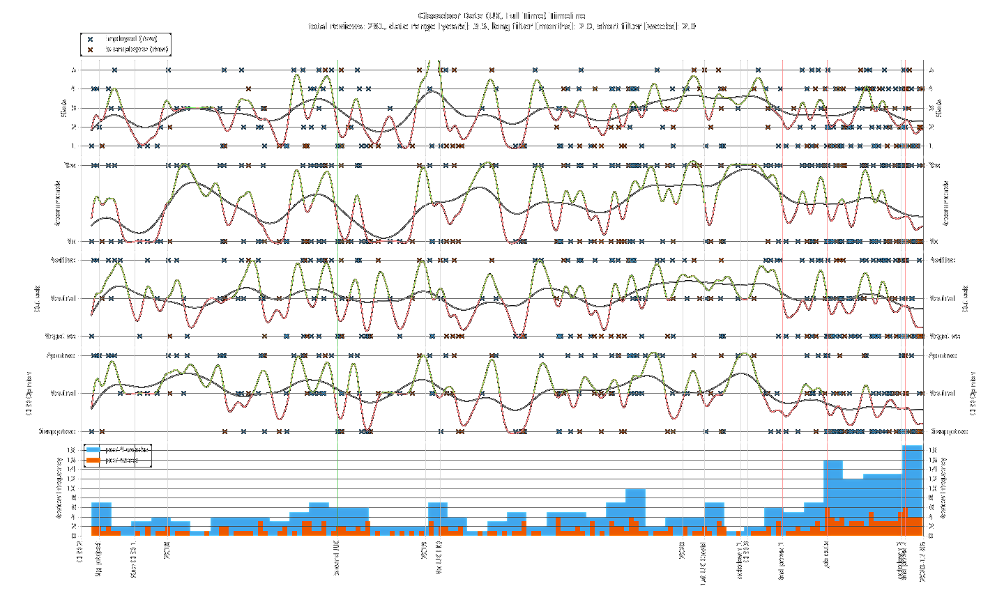
The most striking thing about the timeline plot is the ramp up in review frequency in the latter half of 2020. Up to “Bad press 1” there is a rough monthly average of 4 reviews. After this point, the frequency remains above average until a spike to ~4 times the monthly average that lines up with “Job cuts”. Meanwhile, the general trend of CEO opinion is downward with a majority of people disapproving. Just after “Lockdown 2”, a new monthly record for review frequency is set with every metric plummeting.
Conclusion
Reflecting on the project’s aim, we have been able to use this Glassdoor review data to get an insight into the views of employees towards their company. Overall, there are no obvious long term trends over the last 3 years with all metrics fluctuating naturally. However, in the past year there has been a clear increase in engagement with the Glassdoor platform. Employees appear to have wanted to express their feelings about the company and, for the majority, the sentiment has been negative. Considering some of the negative publicly visible events that have happened since “CEO 3”, this is hardly surprising. Let’s hope the company is able to reverse this undesirable trajectory…